Also looks like it’s removing an important visual affordance (i.e., which areas you can click to drag the window), unless I’m misinterpreting it
The top bar has been full of buttons with no whitespace for a year or more now, that’s not new (you can still drag the window using the whole bar, but it’s definitely not intuitive and made me subconsciously do Win+drag to be safe many times).
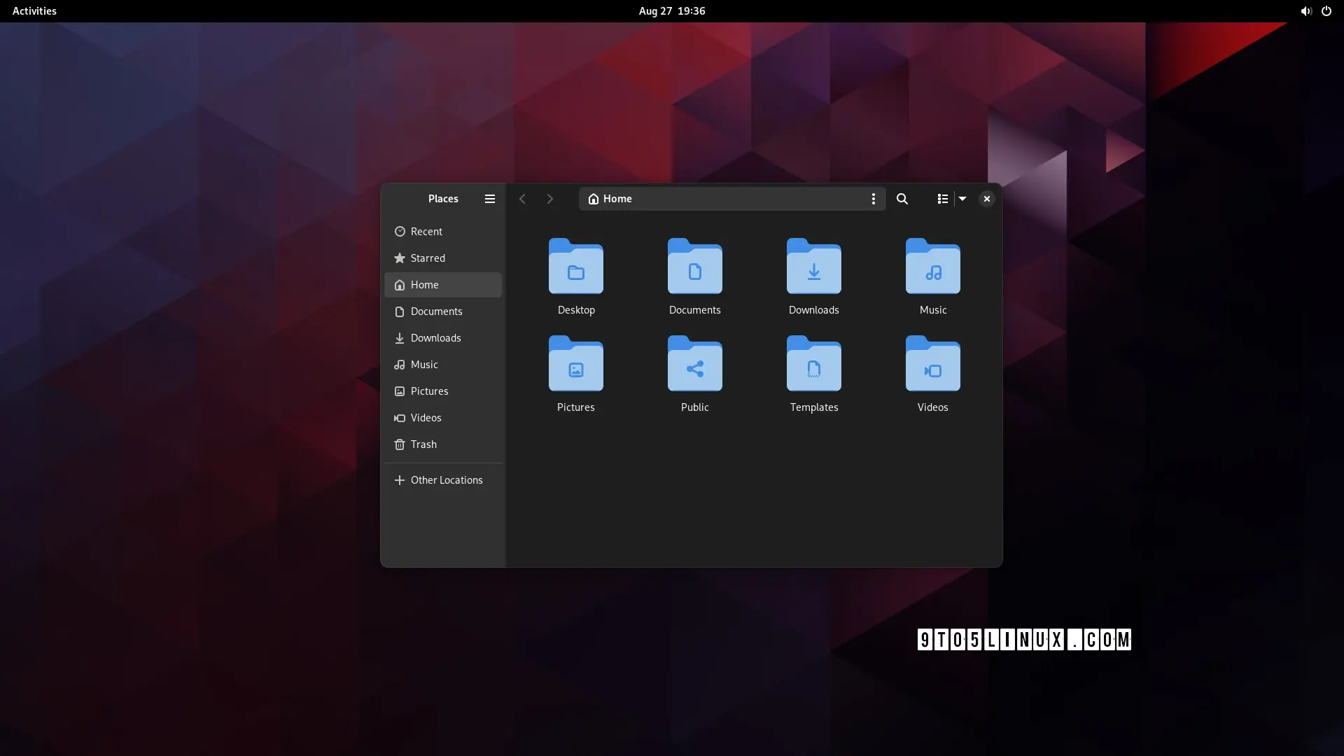
This seems to be a relatively minor visual update to have the left sidebar fill the whole window - maybe they want more space for shortcuts at a given window height? No clue.
Edit: never mind, checked again and it’s literally just a tiny visual update with no change to the actual content of the sidebar, but it takes some space away from the top bar.

The top bar has been full of buttons with no whitespace for a year or more now, that’s not new (you can still drag the window using the whole bar, but it’s definitely not intuitive and made me subconsciously do Win+drag to be safe many times).
This seems to be a relatively minor visual update to have the left sidebar fill the whole window -
maybe they want more space for shortcuts at a given window height?No clue.Edit: never mind, checked again and it’s literally just a tiny visual update with no change to the actual content of the sidebar, but it takes some space away from the top bar.
i welcome merging two triple-dot menus into one, according to screenshots.
Thank you internet person, you have changed my life forever.