
I prefer ‘The Legend of …’ over ‘The Legend of …’ myself.
You must log in or register to comment.
I really hate grid based displays of lists like this. Such an awful design pattern.
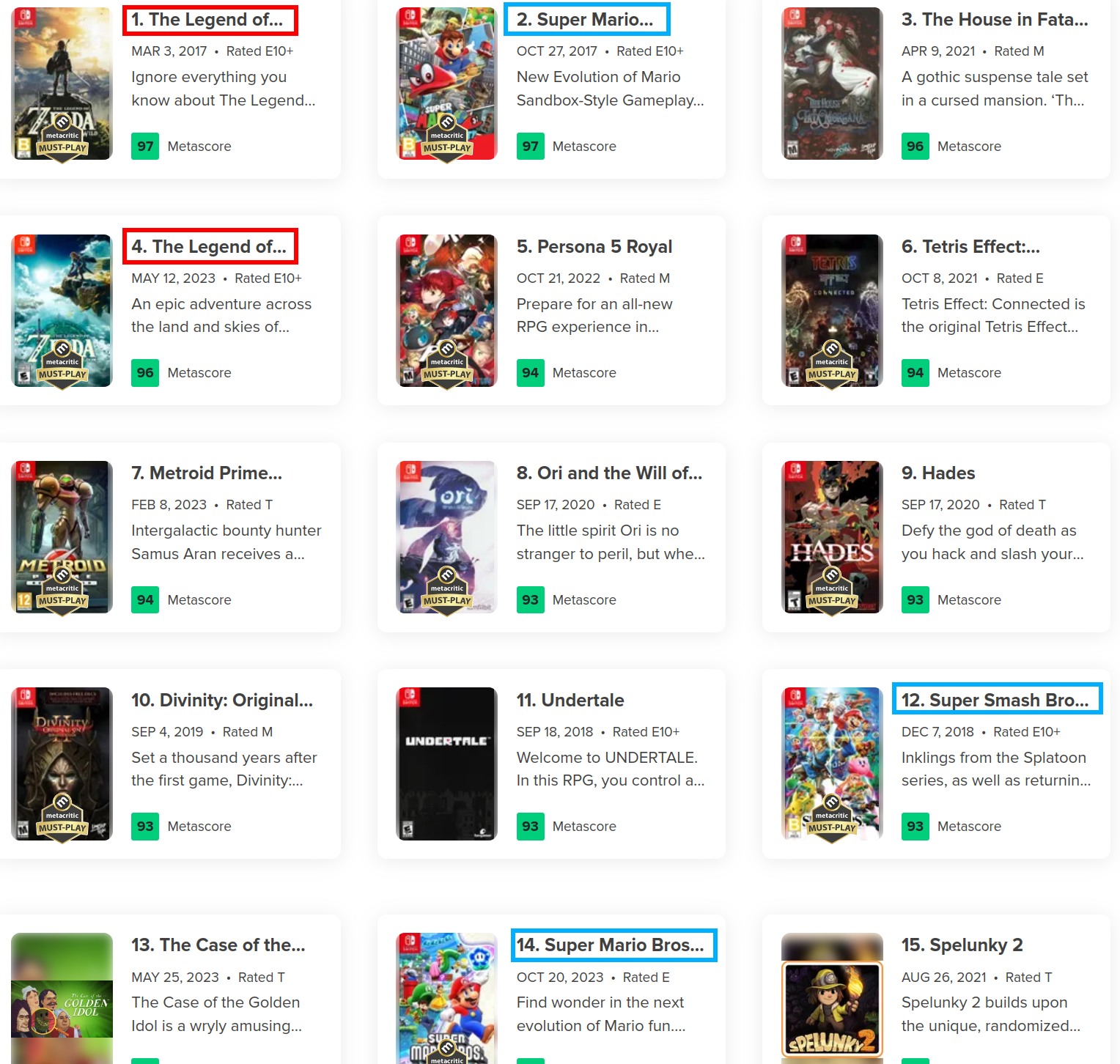
How come they can only fit “Super Mario” on 2 but they can fit “Super Mario Bros” on 14?
Odyssey is a longer word than Bros
If they elide based on words (not letters), then it’s weird that 12 is displayed as “Bro”…
They probably use the built in CSS ellipse and have it to not cut off words, which is the default.
Well, “Bro” is cut off. That game is called “Super Smash Bros. Ultimate”. But someone else pointed out that there may be a more intelligent heuristic, where it will cut off words, if e.g. only the last 1–2 letters need to be cut off…
It is correct. Luigi is not in this game so it is singular
Luigi is in the balloon hiding minigame
Think it depends on how long the word is that is getting elipsised too if it’s only cutting off a letter or two of the end it’ll show it
“Maker” is one letter longer than “bros”
Technically correct but not the game in the picture.
The legend of… (click here to continue reading)
In their defense, designing a…
Aww, I had hoped that url was real and contained snarky elaboration! 😁
Edit: guess the lack of suffix should have tipped me off 😄
Gotta be ‘The Legend of Link’ since he is the main character that we control throughout the game right? Any other name wouldn’t make sense ofc
Link is actually the name of the princess, the character’s name is Zelda.
I see you’ve been down the femboy Link rabbit hole too…
I ain’t been down no femboy hole what are you talking about??
Don’t knock it til you’ve tried it
(After the jump)
I’ll be honest, since Opencritic came about I’ve only very rarely been to Metacritic. The site is just rubbish by comparison.
Hmm, OpenCritic doesn’t seem to have any movie reviews. That’s mainly what I use MetaCritic for.
Yep it’s a click generator
It looks fine at smaller resolutons. Whoever setup the largest resolution just fucked up.
it’s ok visually impaired people who use screen readers don’t need to worry about that at all. in fact its also hidden behind aria-hidden so even if they wanted to, it wouldn’t make a difference. like web developers; it’s not hard to consult one person on making your new design accessible…
You don’t even need a blind person just a screen reader
Super Mario… you won’t BELIEVE what happened next!
I’m suprsied fandom hasn’t completely fucked the ui up yet
Yeah that design choice is bizarre as hell. I remember visiting some pages and it felt like I was deciphering shit again and again to understand what was going on on the damn site.


